
.svg)
I designed a responsive, progressive web app for 8000+ churches to track survey participants, replacing an old tool that consumed over 3300 annual working hours.
Updating heavy amounts of data is easy and trackable with side panel forms.
Works on mobile, tablet, and desktop.
Live commenting allows churches to quickly connect with their partners about potential updates and problems, allowing for streamlined communication and greater efficiency.

Compassion churches are required to carry administer surveys to its program participants. These surveys are used to track overall satisfaction, as well as program and child outcomes. Every survey requires a specific number of its participants, so it is important to track who can participant to report it back to the Compassion office.

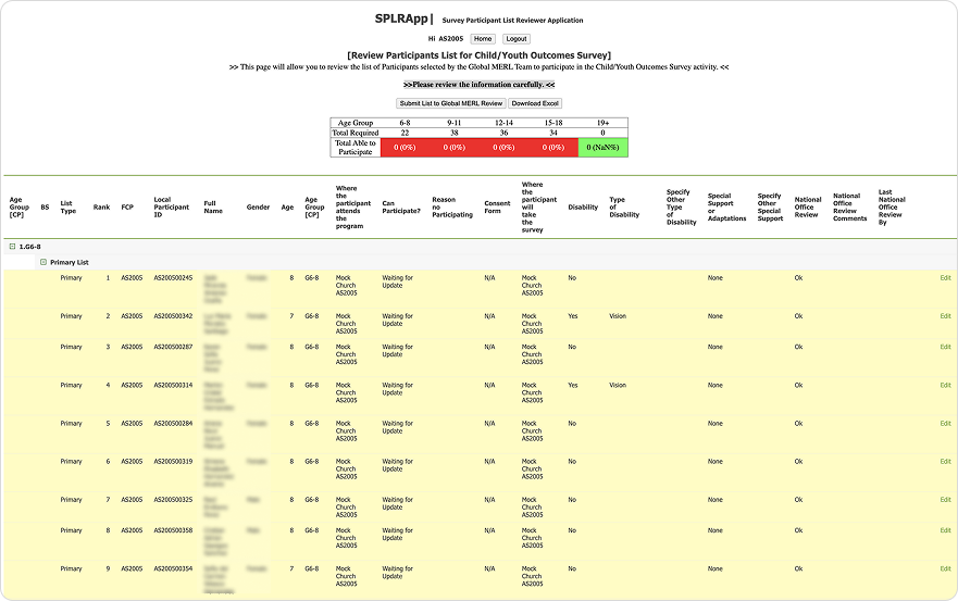
The current tool was not scalable. Users spent hours using it, downloading spreadsheets, then updating it. the communication was by emailing spreadsheets back and forth, a pattern that was not sustainable

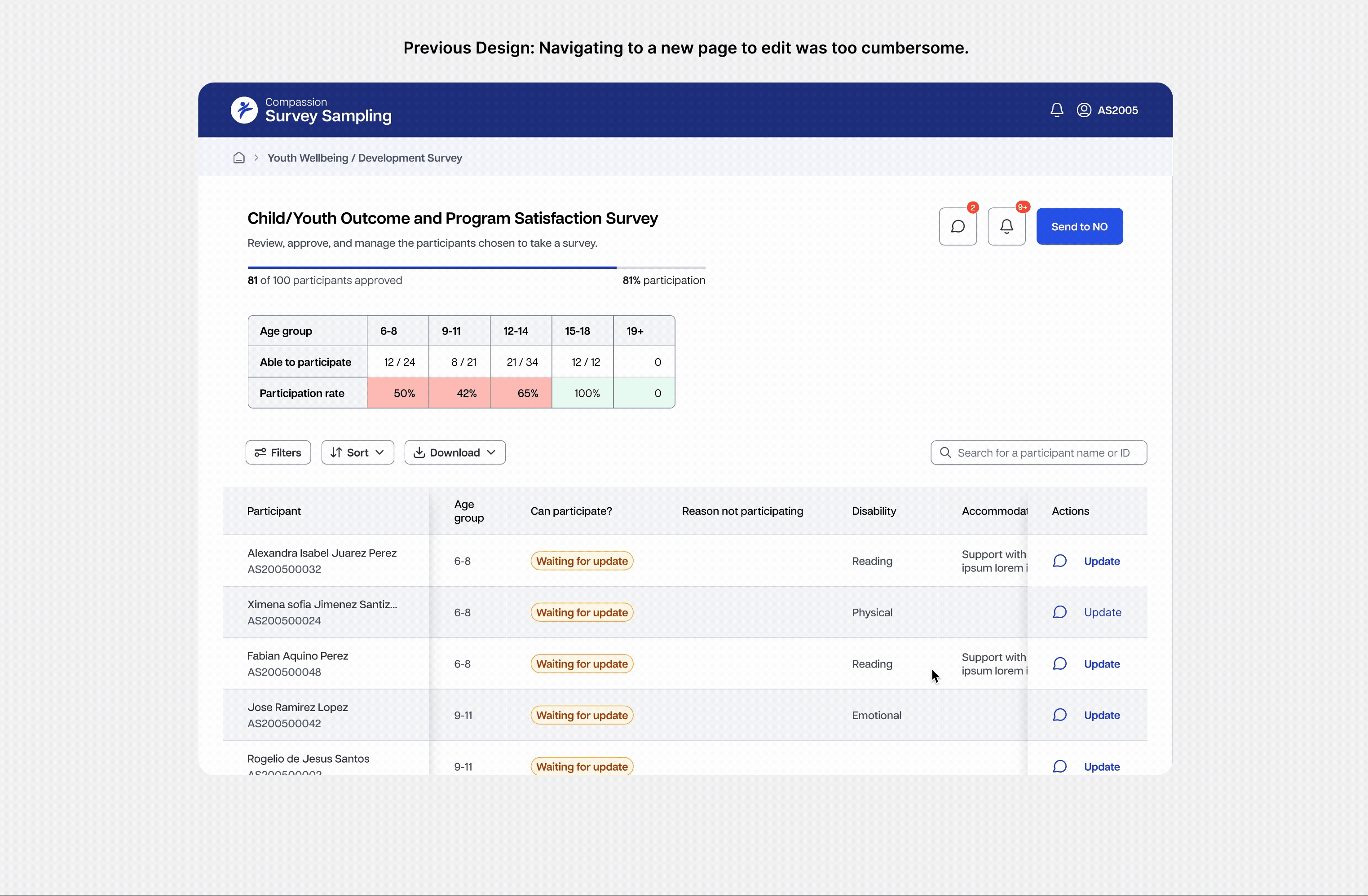
Users needed to update the table with new participant statuses. However, due to the size and amount of info in the table, even finding the edit functionality was difficult.
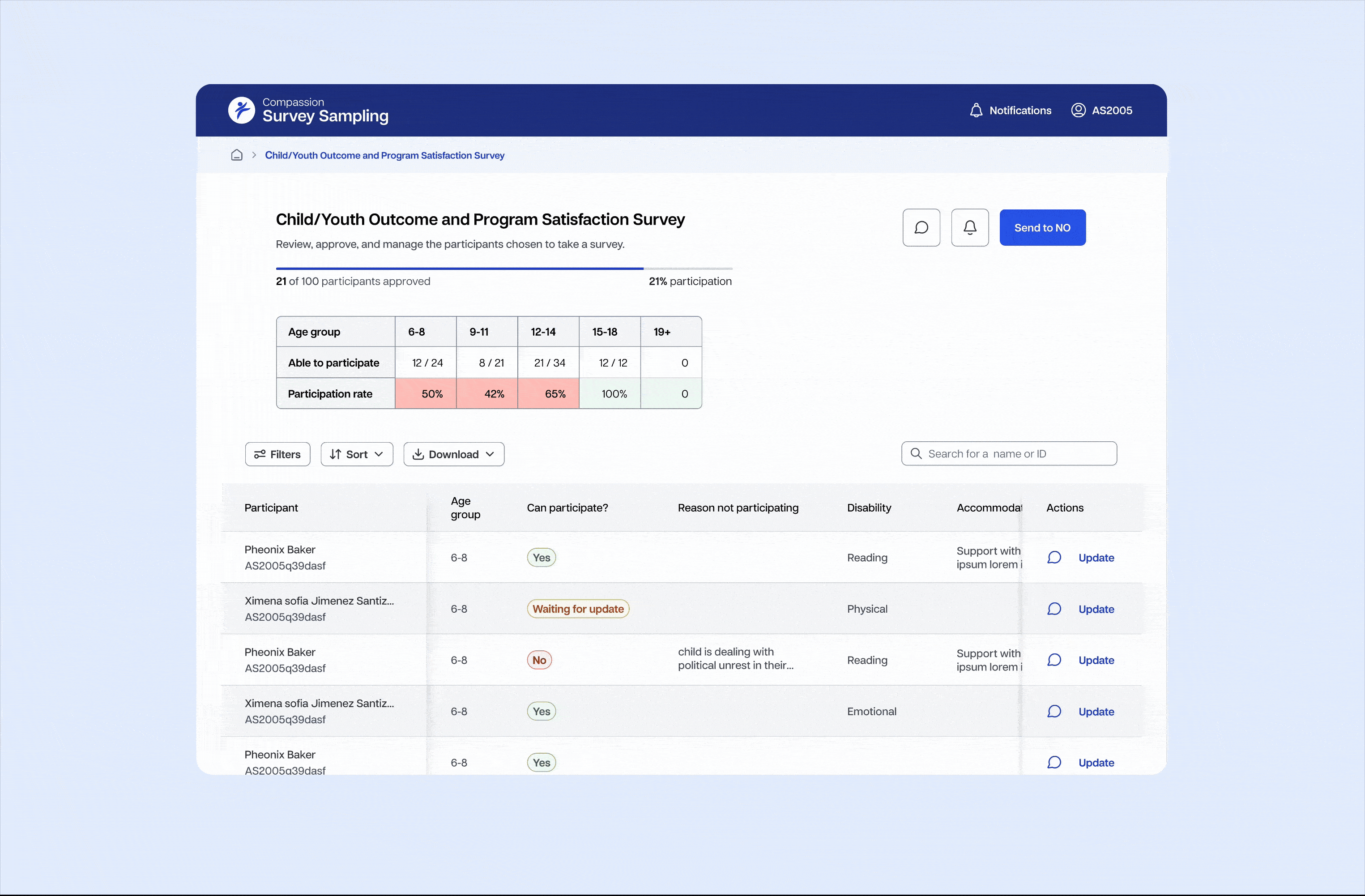
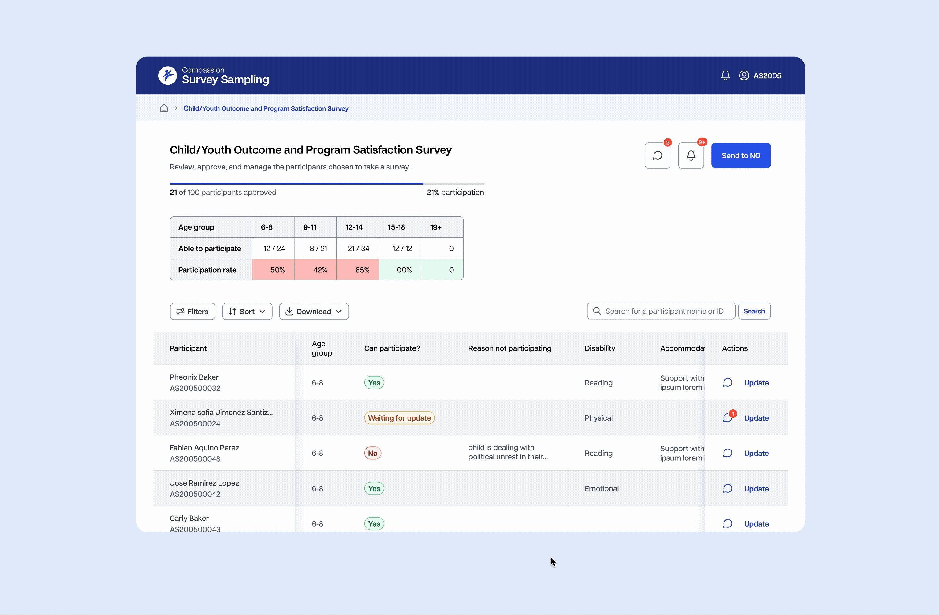
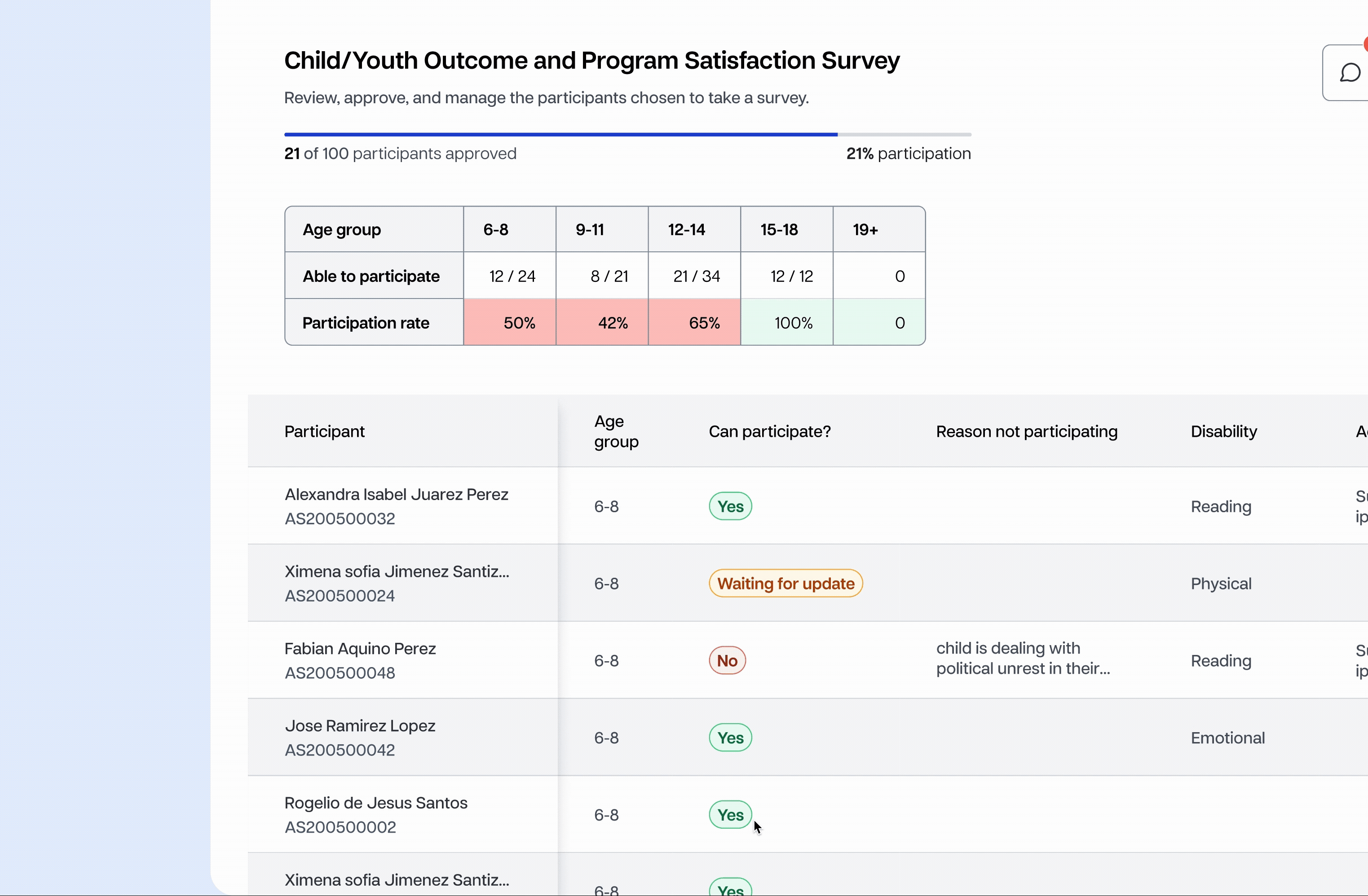
One of the first places I wanted to improve was shrinking down the table. The table took up a huge part of the screen, while only a few columns needed to be updated. In order to save space yet retain the context, I moved the nonessential information to a different tab.
.svg)
By reducing the amount of space users need to scroll to view essential information, time and cognitive load is saved!
.svg)
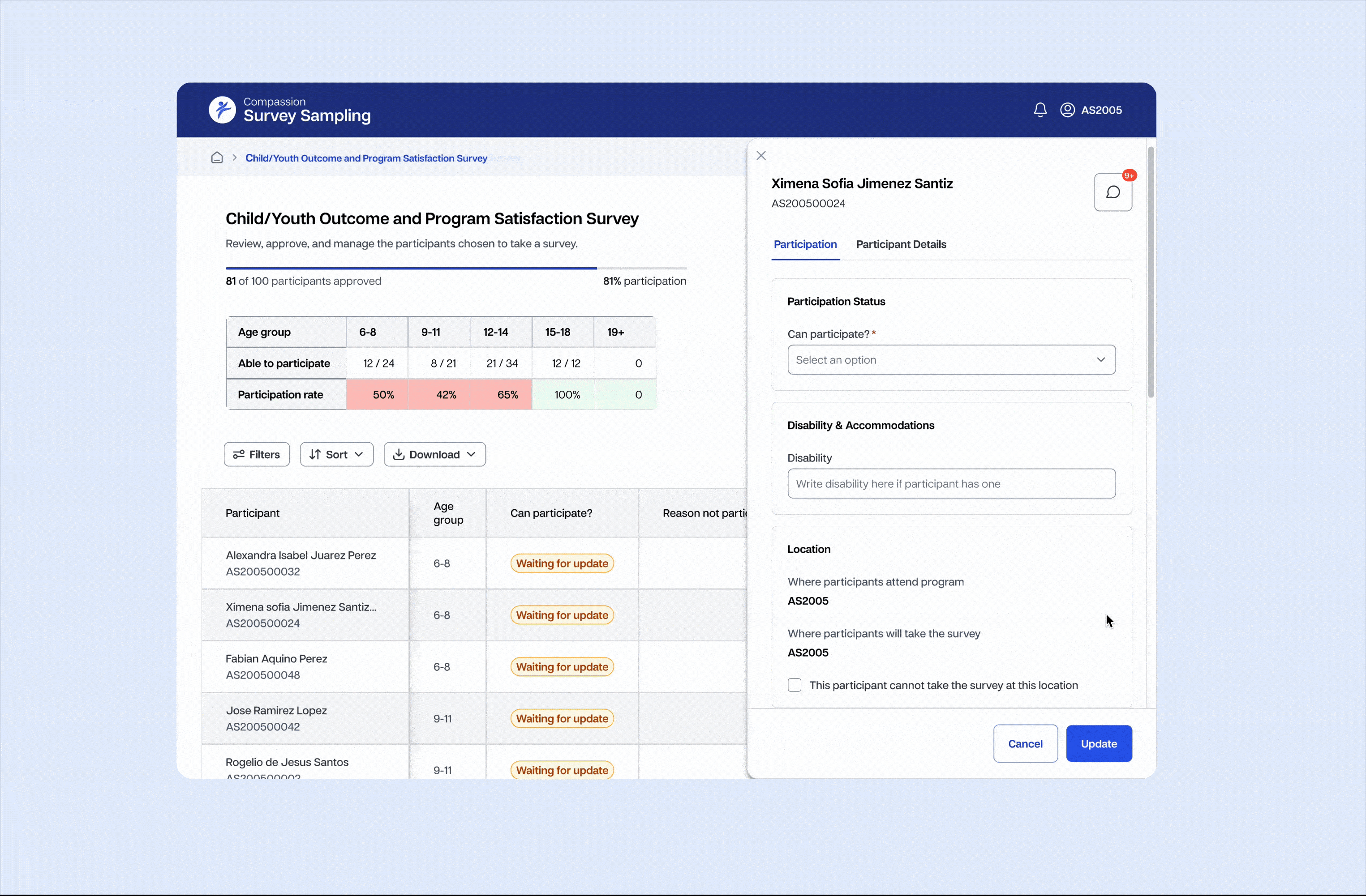
When users need to edit a participant status, a side panel will surface.
I explored many ways to expand and edit the table information. One of the ways was by expanding in to another page. However, I opted out of this experience due to the inefficiency of it.
Comments also open and appear in side panels for each participant, allowing for streamlined communication about the status of each participant.
After the first version of the new Caspio was shipped, the MVP was brought to stakeholders for review. One of the first things they requested was a way to update even quicker. Thus, we added inline editing in to the table.
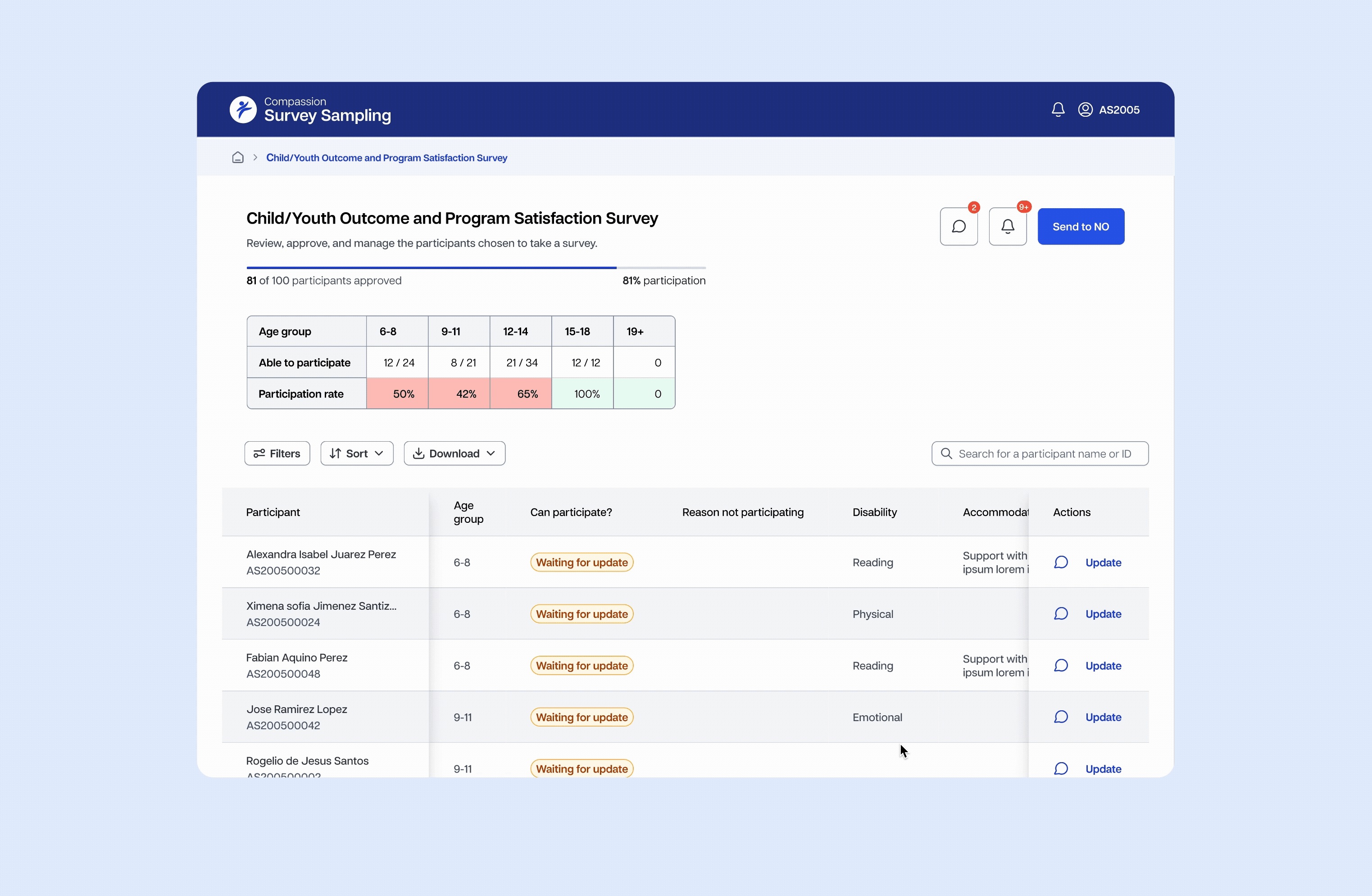
A crucial part of the web app was the ability for the application to work on both mobile and desktop devices. Previously, users were required to make updates on desktop, which was difficult for offline environments. In order to ensure usability, I designed specific components with multiple breakpoints in mind.
I defined breakpoints according to common viewport size standards. It was important to me to stay in alignment with developer standards. The breakpoints I chose were customized to our users needs. Some used computers, phones, and some were using tablets. The breakpoints accounted for all circumstances.

The comments panel needed the most adjustments to account for smaller screen widths. On mobile views, comments even move to a separate page.

Updating heavy amounts of data is easy and trackable with side panel forms. Only the most relevant columns show, while less relevant data is visible on the side panels.
Works on mobile, tablet, and desktop.
Live commenting allows churches to quickly connect with their partners about potential updates and problems, allowing for streamlined communication and greater efficiency.
This was one of the first projects where my design work went straight in to production and I was able to work very closely with product managers, headquarters, and developers. It taught me a lot about design documentation, learning the needs and workflows and others, and being available to troubleshoot the design at any time. Survey Sampling will be rolled out to many churches by April 2026, where we will learn more about user needs and usability improvements. I will update this case study as that time comes.
I was tasked with creating an MVP in less than a week's time for this product. It was difficult, but it taught me to prioritize, refine, and stay focused on the bigger picture rather than get bogged down by details. It also taught me how to communicate and work with developers and product managers to refine the design iteratively as it was actively being worked on.

