Overhauling NeuroLeap’s SaaS platform for child health specialists as sole product designer, decreasing user task errors by -84% and increasing usability rating by 52%.
.gif)
Child specialists need tailored, engaging, and community-driven intervention activities for their children with disabilities. NLONE Cloud is a one-stop platform where specialists are able to buy, use, and create personalized activities for their children.
I conducted usability testing with specialists on the 3 central tasks of the app, tracking the number of errors users made and their user rating (1-10).

After testing, I mapped out the user errors, identifying “hotspots” of confusion.

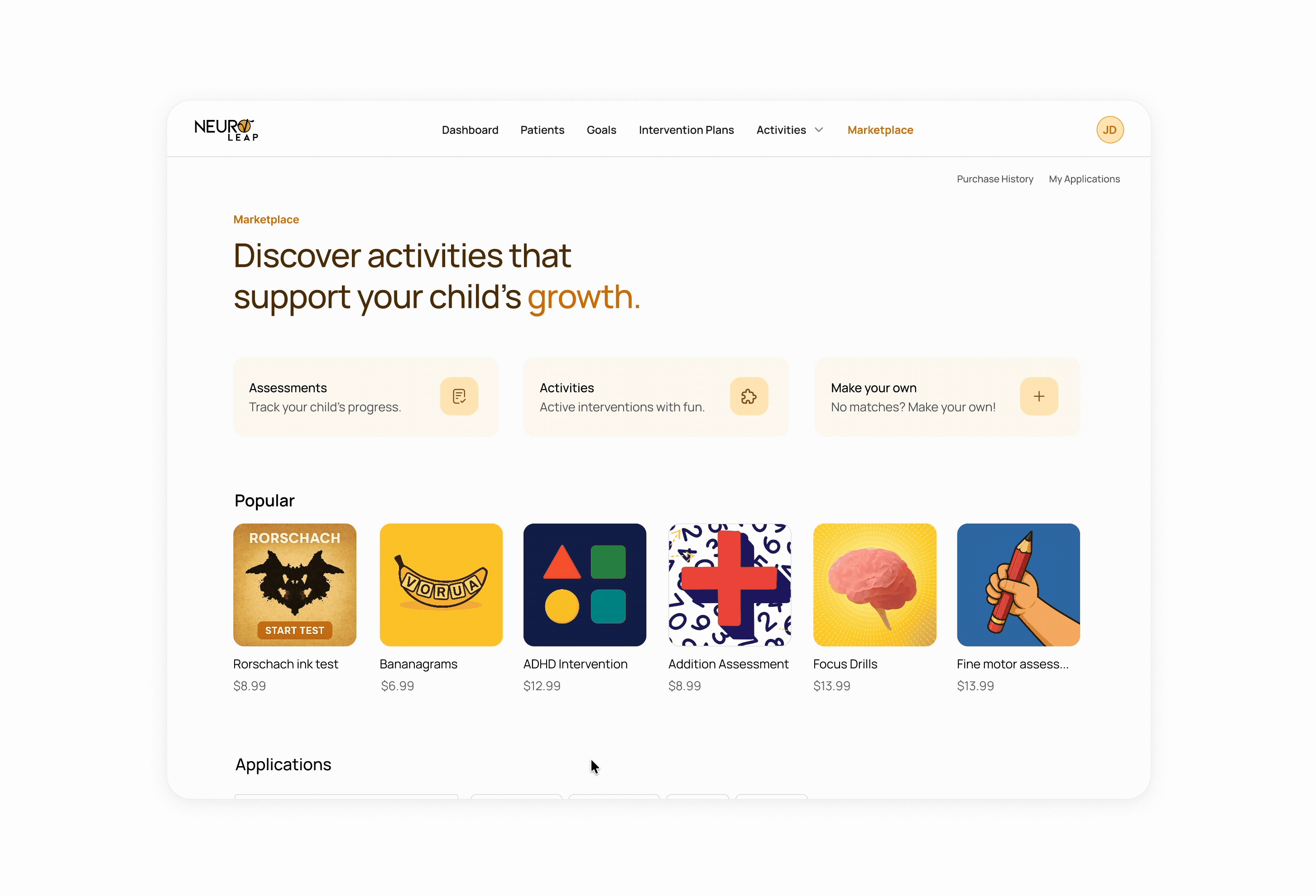
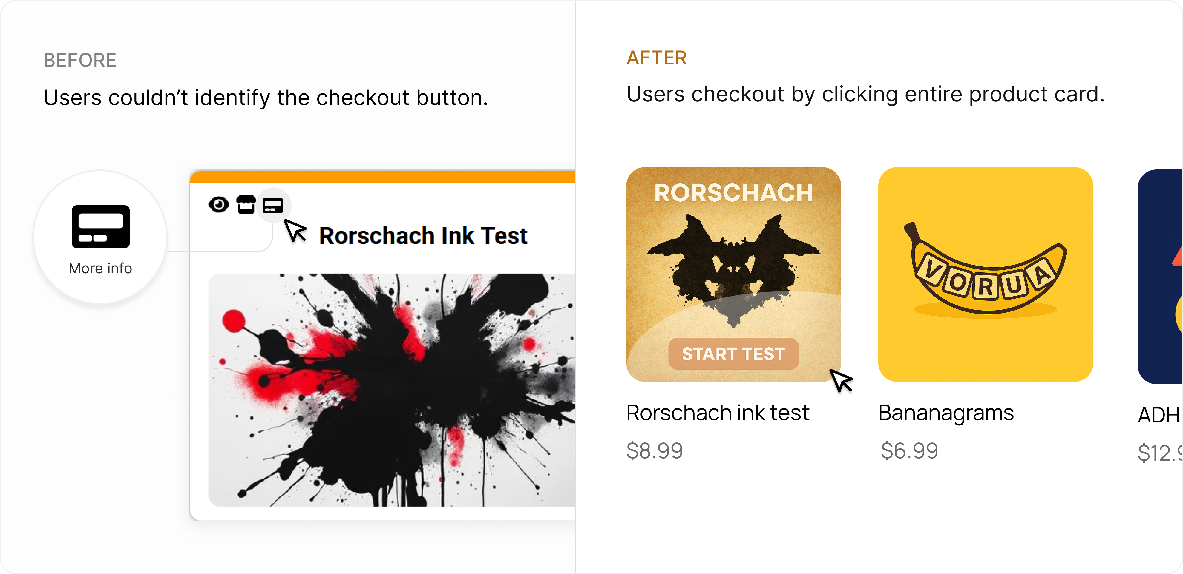
Users could not find prices/checkout process, which were hidden in unfamiliar icons.

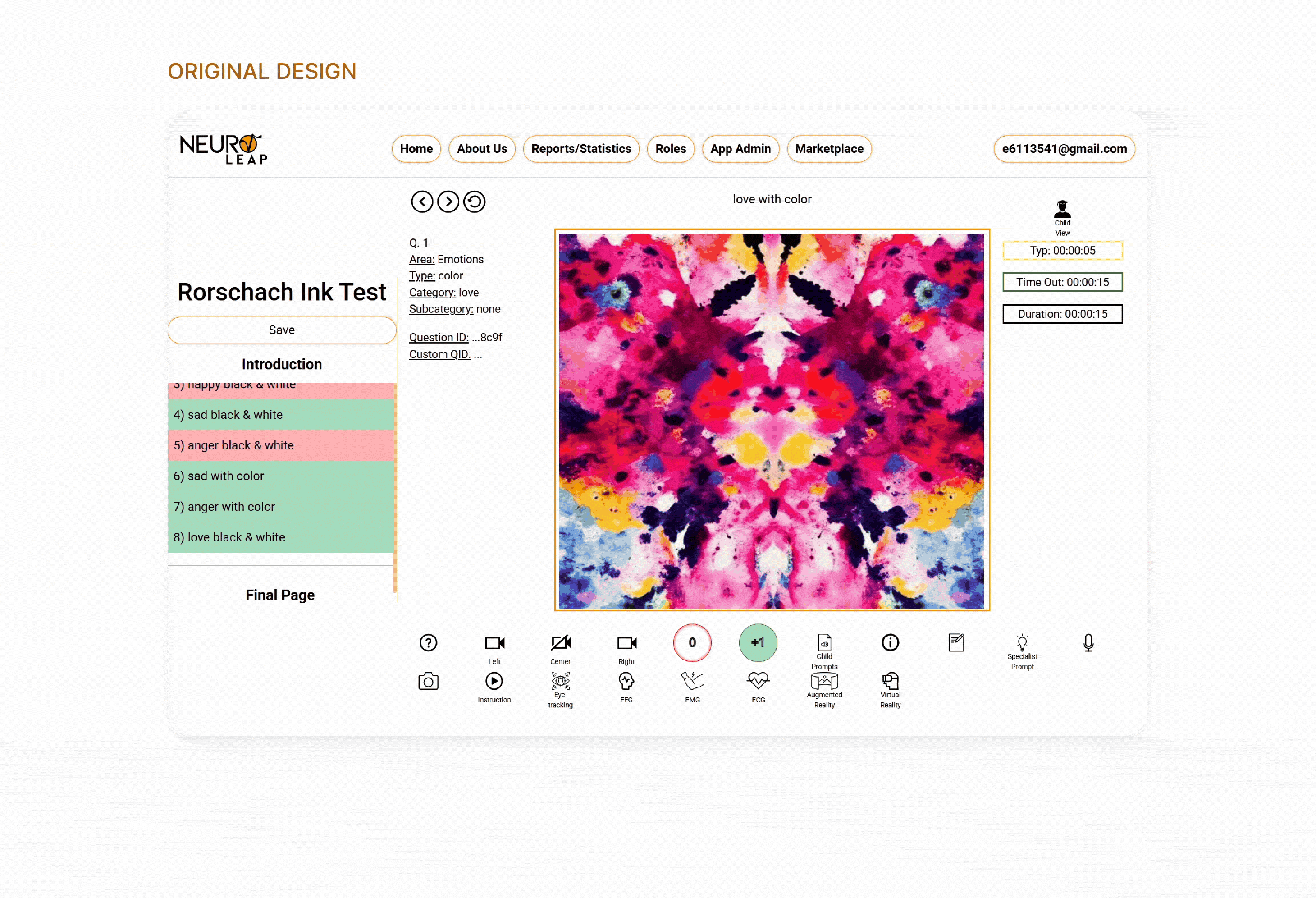
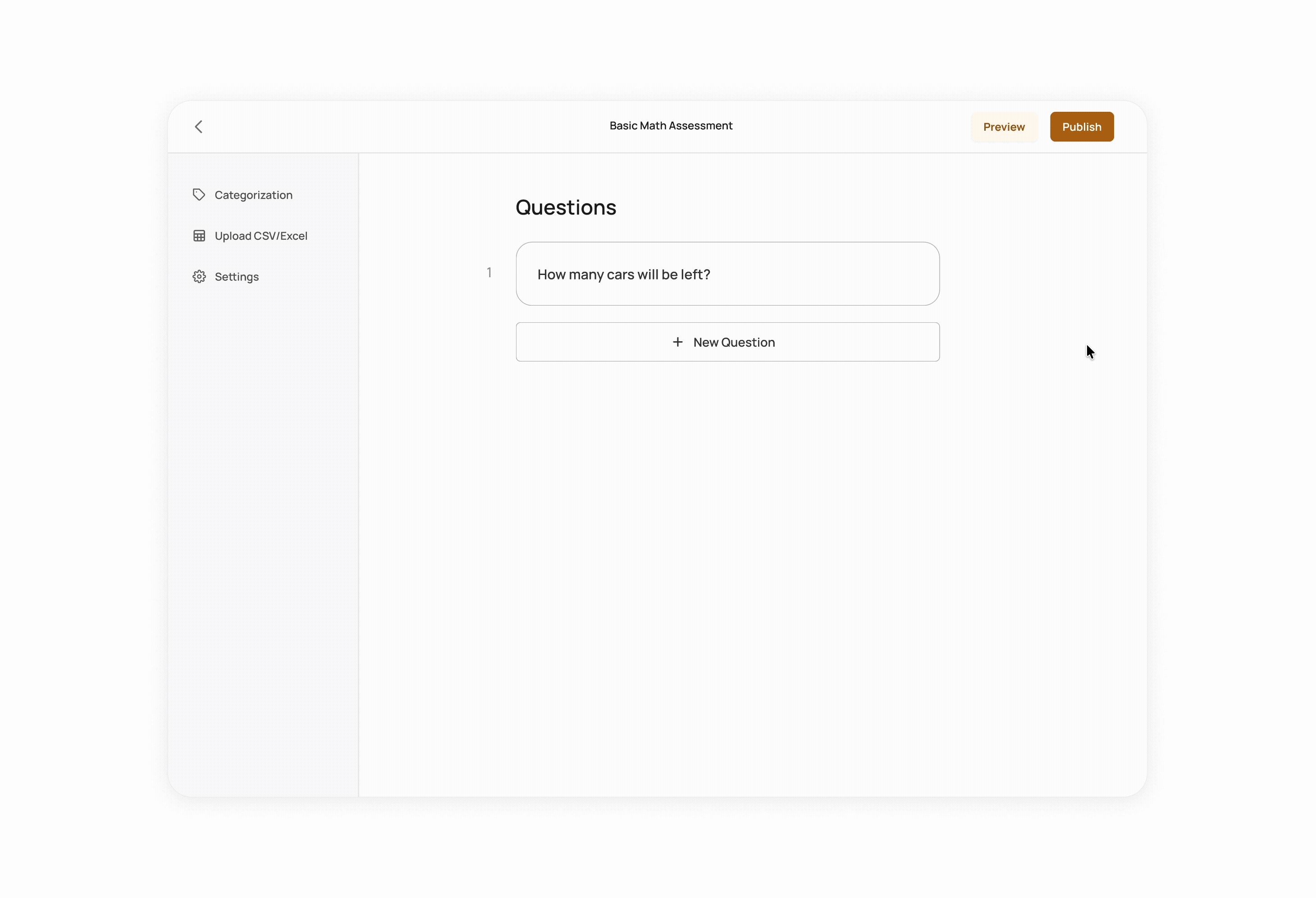
Child specialists could not understand the grading buttons for activities, which was cluttered with buttons and images with no visual hierarchy or grouping.

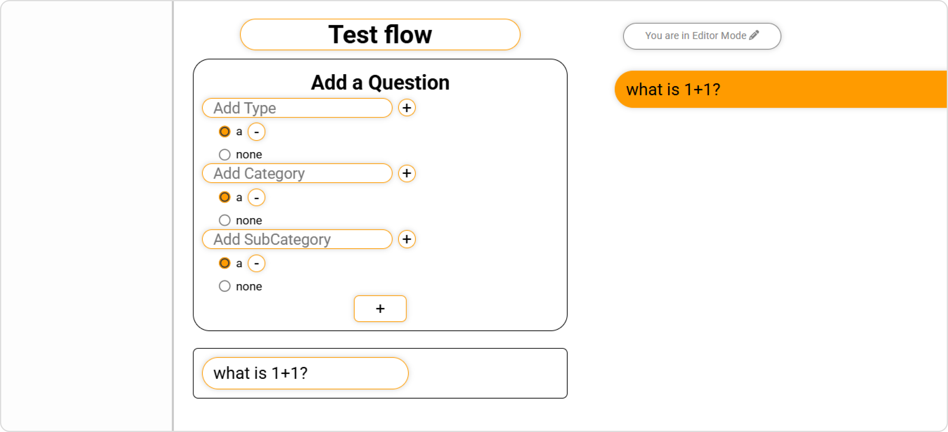
When specialists were making their own activities, the process felt constrained and limited in customisability because of the required pre-categorization fields, preventing specialists from organizing questions in their own mental models.


Primary tasks should be intuitive, easily discoverable, and broken down in to steps.

Product’s experience and capabilities should parallel the complex workflow needs of child disability specialists.
As I refined my understanding of the product with the team and received their feedback, I was able to push towards the best layout possible, which often meant deprioritizing minor functionalities to highlight important ones.
The grading buttons (“0” and “+1”), were buried with 10+ other buttons that were less important, confusing and distracting users on what they should select.


It took me several tries to find a layout that the team and I were happy with. However, as I refined my understanding of the product with the team it was easier to come to this conclusion once more.
Similar to popular ecommerce sites such as Amazon, shop.com, and eBay, users understand that clicking on product cards leads to a product page with a checkout option.
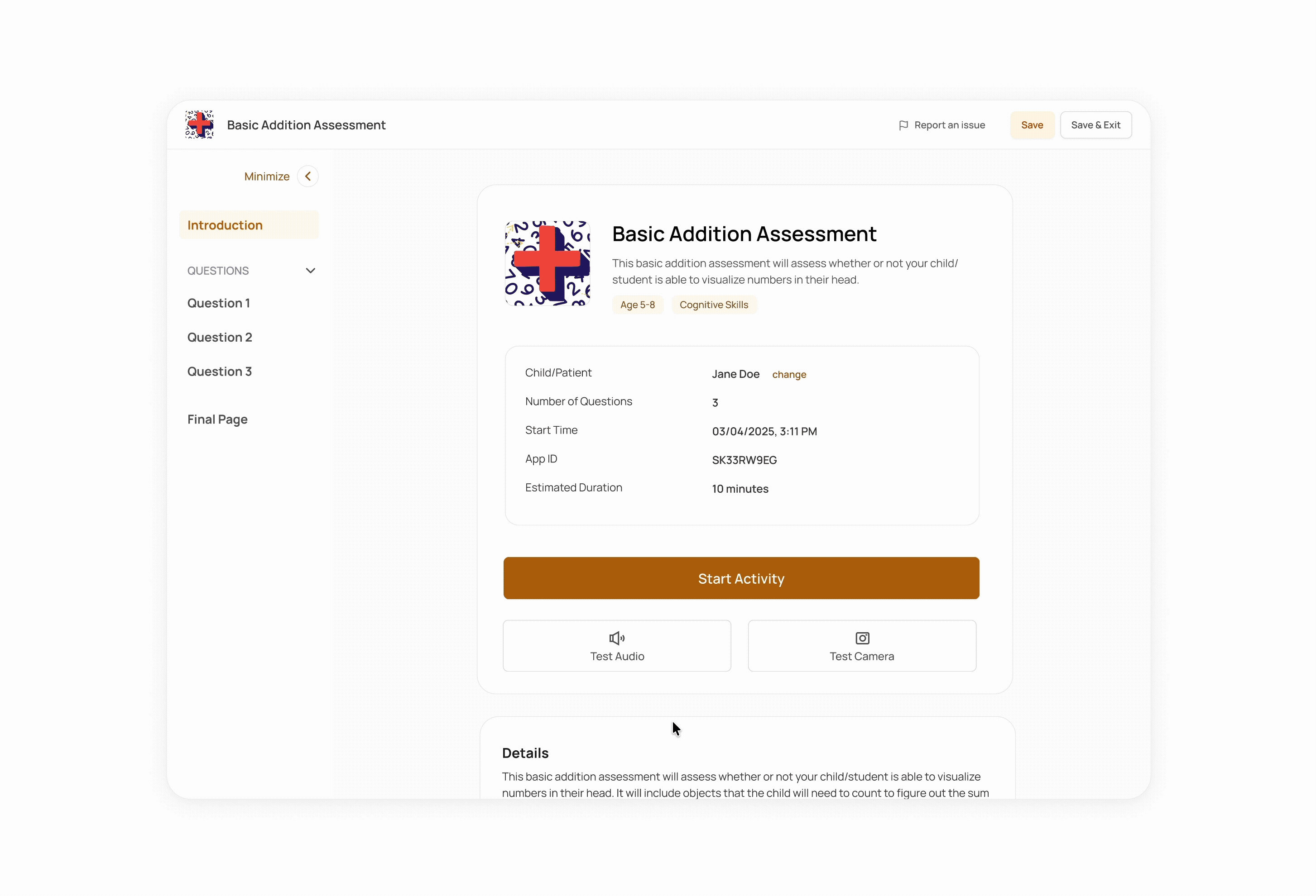
A step-by-step process progressively discloses information to users without overwhelming them. By switching to a multi-page layout, we are able to fit in more questions and customization without sacrificing usability.
Fields are grouped strangely, with non-intuitive question formatting that was limited in options.
.svg)
Though many specialists use categories to organize activities, leaving it optional allows specialists to have full autonomy on the activities they need and want.
Users were forced to categorize their activity’s questions before customization was permitted.


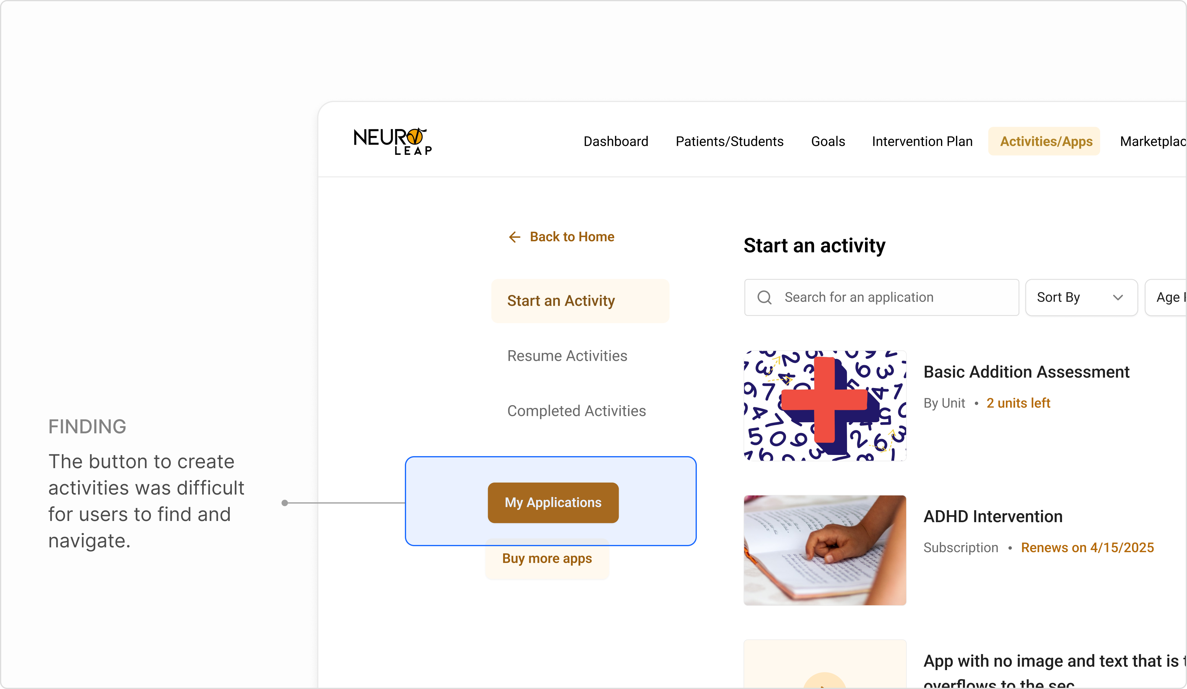
Users had difficulty finding where to create activities, with 3/5 users failing to find the right button on the first try. This was in part due to grouping and navigational hierarchy.
Users had trouble identifying the button to make activities
.png)