
Improving the intervention experience for child disability specialists

Context
Every child deserves tailored care, but large caseloads make it difficult. NLOne helps providers bridge the gap.
NLONE Cloud is a one-stop platform where child disability providers (OTs, PTs, reading specialists) buy, use, and create personalized activities for their children across different skill levels, age ranges, and disabilities.

NLOne helps providers...
Purchase activities from the provider community
Use activities with children during sessions
Create custom activities for their children
Problem & User Research
The current interface was mired with failed interactions, increasing work instead of reducing it.
Let’s conduct a usability test…

Main tasks
Buy an activity
Find and start it
Create a basic addition activity

Success metrics
Errors per task
User rating (How intuitive task felt, 1-10)
Tasks were unfamiliar, overwhelming, and misaligned with their workflow.

= Misclicks during a task

Hidden Checkout Process

An overwhelming interface

Lack of workflow similarity
Solution preview
Redesign that reduced usability errors by 84% and increased user rating by 52%

Decision 1
Using activities should feel simple and focused
When using activities with children, specialists need to quickly work through questions without being distracted by details.
Keep primary actions the main focus

BEFORE
Grading buried under cluttered UI
Hidden in a group with 10+ other buttons

AFTER
✓ Grading is largest action
In separate section from other buttons
On right-hand side for easy access
Visual Design Iterations
Finding the right layout was a process of reducing visual noise, refining grouping, and adjusting touch target sizes.


Decision 2
Creating activities should be flexible + workflow-aligned
How can we provide enough structure for detailed activity creation without constraining what providers can design?
More customization potential, less complexity
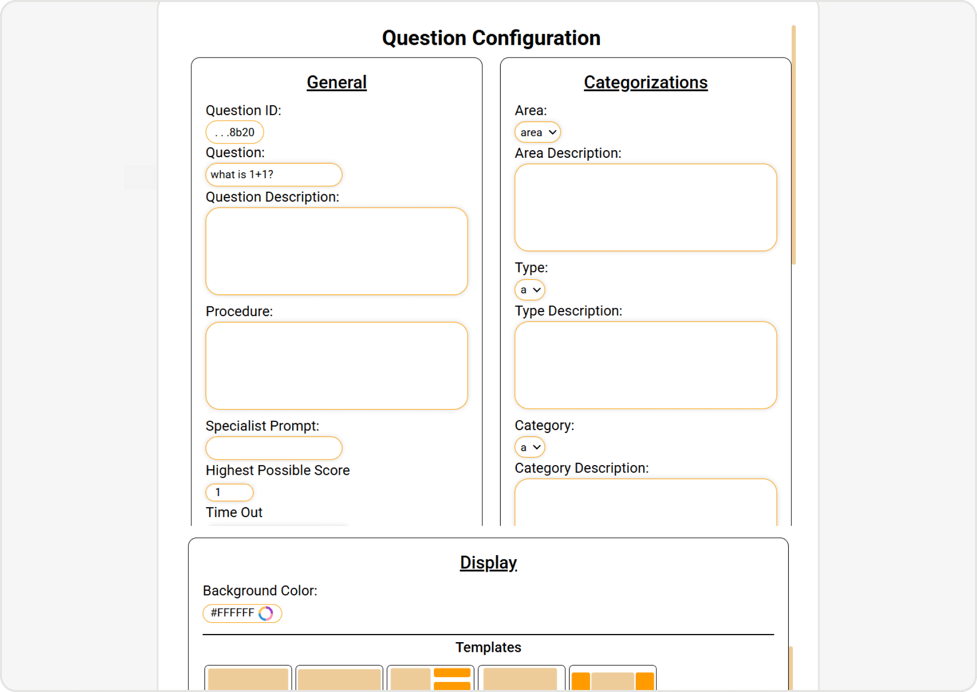
BEFORE
Single-page customization
Customization options were jammed in to 1 page, creating overwhelm and limiting customization

AFTER
✓ Step-by-step question creation
Multi-step layout gives more space for customization, while progressively disclosing information.
Remove unnecessary roadblocks
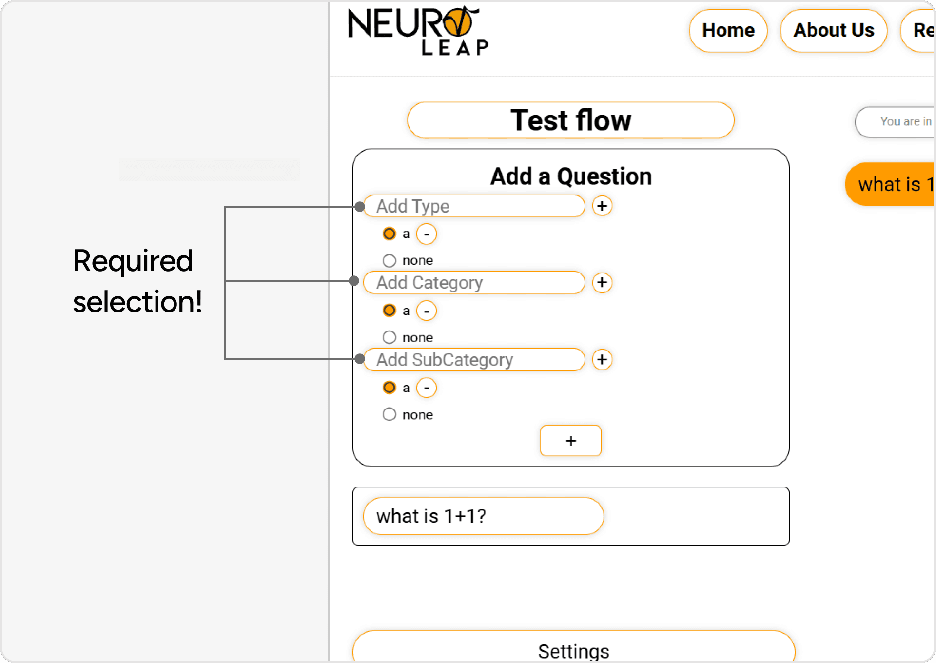
BEFORE
Required categorization
Users froze at this step, unsure of how to integrate this with their activity needs

AFTER
✓ Optional categorization
Users can quickly skip over categorization if it makes sense for them
User Feedback
Making activity creation more discoverable
There was an 84% reduction in task errors and a 52% increase in user rating. However, usability testing showed activity-making was hard to find...
Increase touch targets (Fitt’s Law)
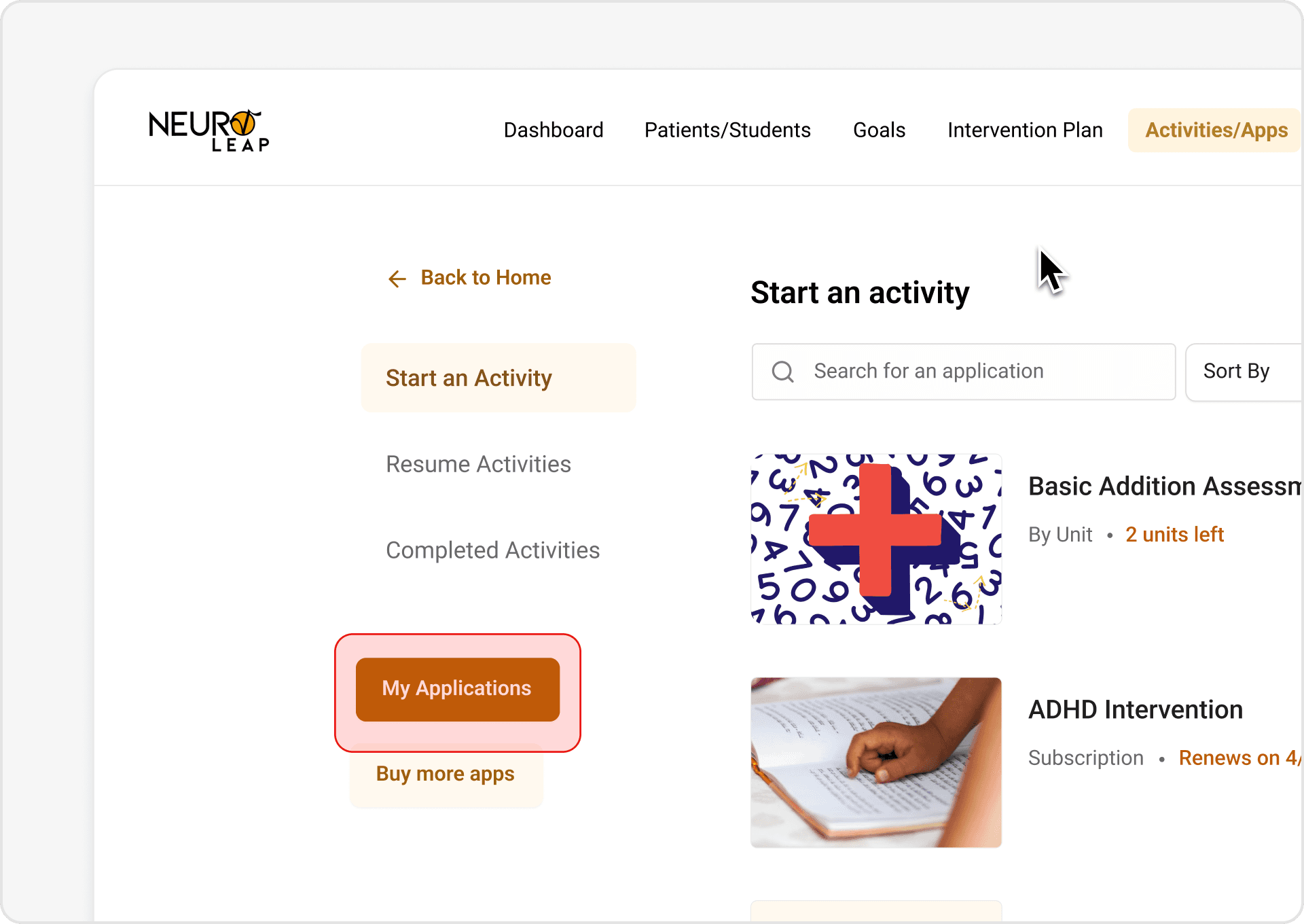
INITIAL ITERATION
‘My application’ button is too small
3/5 users did not find correct button

FINAL ITERATION
✓ Larger entry-point
A separate, larger surface area entry-point in to activity making makes it more noticeable for users
Support users mental models

INITIAL ITERATION
No way to find activity creation from nav
Users’ first instinct was to search the navigation bar for a “create activity” section

FINAL ITERATION
✓ Users can select activity creation from main nav
Create a direct opportunity to create activities through the menu!
Final Design
Buy activities you need like second nature
Work through activities with your child without getting overwhelmed

Make your own activities to match the exact needs of your child
Reflection
What I’ve Learned
Observation > Metrics
While usability data was a good representation of the UX, there were other behaviors (such as staring at a screen before acting) that tell a deeper story.
Go for the big change!
It is easy to want to change as little as possible during a redesign and focus on key painpoints. However, I’ve learned that taking risks and adding your own vision can take a product above and beyond.